7 Ways to Frame Your Composition
Stuck with a blank shot list, unsure how to frame your shots for maximum impact? Planning your composition can be overwhelming because you want the maximum emotional impact for your audience.
It all goes down to how you arrange your Mise-en-scène elements in the frame. Enter the ‘Art of Composition’ to save the day that’ll transform your visuals to their A-game. Framing is the foundation of visual storytelling that influences how your audience perceives and engages with your content.
Let's learn more about the 7 key principles to master film composition and elevate your videos.
The Rule of Thirds
The Rule of Thirds is a fundamental principle in film composition that elevates the impact of your videos and photos. This technique divides your frame into a 3x3 grid, guiding you to place key elements at the intersection points or along the lines for a more natural and engaging composition.
Importance of the Rule of Thirds:
Natural Visual Flow: Dividing the frame into thirds creates intersection points that mimic how we naturally tend to look at an image. Placing key elements on these points creates a more balanced and aesthetically pleasing composition.
Emphasis on the Subject: By placing your subject off-center, you avoid a static, centered composition and helps you draw the viewer's eye to the subject in a more dynamic way.
Leading Lines: The lines created by the grid can be used to lead the viewer's eye towards your subject or point of interest within the frame.
When to Use the Rule of Thirds:
General Situations: It's a great starting point for most shots, especially landscapes, portraits, and establishing shots.
Off-Center Subjects: When your main subject isn't perfectly centered, the rule of thirds helps guide placement for a more dynamic composition.
Horizon Placement: Use the horizontal lines to position the horizon line either in the upper or lower third of the frame, depending on what you want to emphasize (sky or foreground).
Leading Lines
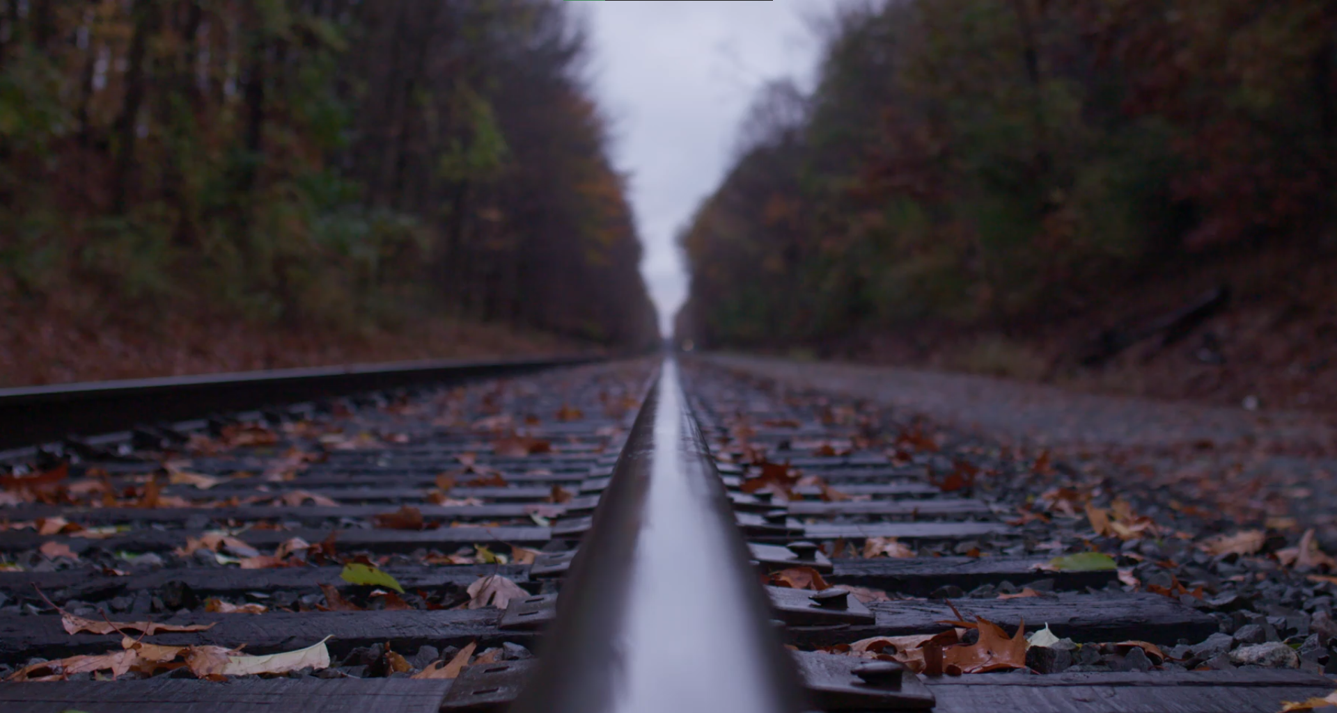
Leading Lines technique uses natural lines within your scene, like roads, hallways, staircases, fences, or even a character's gaze, to guide the viewer's eye towards your subject or point of interest. By subtly influencing how viewers see your scene, leading lines enhance their understanding and engagement.
Importance of Leading Lines:
Directing Attention: Leading lines act like visual pathways, it draws the viewer's eye towards a specific point of interest within the frame. This can be the main subject, a background element that adds context, or even a character's gaze.
Adding Depth and Dimension: Lines that recede into the distance, like roads, hallways, or railroad tracks, create a sense of depth and pull the viewer into the scene.
Enhancing Emotion: Leading lines can evoke specific emotions. Diagonal lines create a sense of dynamism or tension, while curving lines can suggest a sense of flow or journey.
When to Use Leading Lines:
Highlighting Specific Elements: Use leading lines to draw attention to important elements in the scene, like a character walking down a path or a building that dominates the skyline.
Creating Depth: Incorporate leading lines that recede into the background to establish depth and create a more three-dimensional feel.
Conveying a Mood: Choose the direction and type of lines (straight, curved) to create a specific mood or feeling in your scene.
Balance and Symmetry
Balance and symmetry are crucial concepts in film composition, influencing the visual weight and emotional impact of your shots. Balance your frame with symmetrical elements for a sense of order and stability, or create an unbalanced composition for a feeling of tension or unease. Here's a breakdown of their importance and how they're used:
Importance of Balance and Symmetry:
Visual Harmony: Balance creates a sense of order, stability, and visual harmony in the frame. This can be done through symmetrical arrangements or asymmetrical balance with strategically placed elements.
Drawing Attention: Symmetry naturally draws the viewer's eye to the center of the frame, where the focal point is often placed.
Evoking Emotions: Symmetrical compositions can evoke feelings of formality, peace, or serenity. Flip side of the coin, asymmetrical balance can create a sense of tension, dynamism, or unease.
When to Use Balance and Symmetry:
Symmetrical Balance:
Formal Settings: Symmetrical compositions are perfect for conveying formality, power, and stability, often used in shots of government buildings, religious structures, or establishing shots of grand locations.
Scenes with Central Focus: Use symmetry when your subject is perfectly centered and you want to emphasize its importance and centrality.
Asymmetrical Balance:
Dynamic Scenes: Asymmetrical balance creates a sense of movement, energy, and dynamism, perfect for action sequences, chase scenes, or showcasing a character's journey.
Rule of Thirds: The rule of thirds often leads to asymmetrical compositions, where elements are placed off-center but visually balanced with other elements in the frame.
Adding a Sense of Realism: Asymmetrical balance is more reflective of how we see the real world, where things aren't always perfectly centered
Headroom and Negative Space
Headroom and negative space might seem like minor details, but they play a significant role in making your shots clear, impactful, and visually pleasing. Here's a breakdown of their importance and how to use them effectively:
Importance of Headroom and Negative Space:
Headroom
Clear Communication: Proper headroom ensures there's enough empty space above a person's head in the frame. This avoids a cluttered feel and allows the viewer to focus on their facial expressions and body language.
Composing for Cropping: Sometimes you might need to crop your video slightly during editing. Leaving enough headroom gives you flexibility without cutting someone's head off in the final shot.
Negative Space:
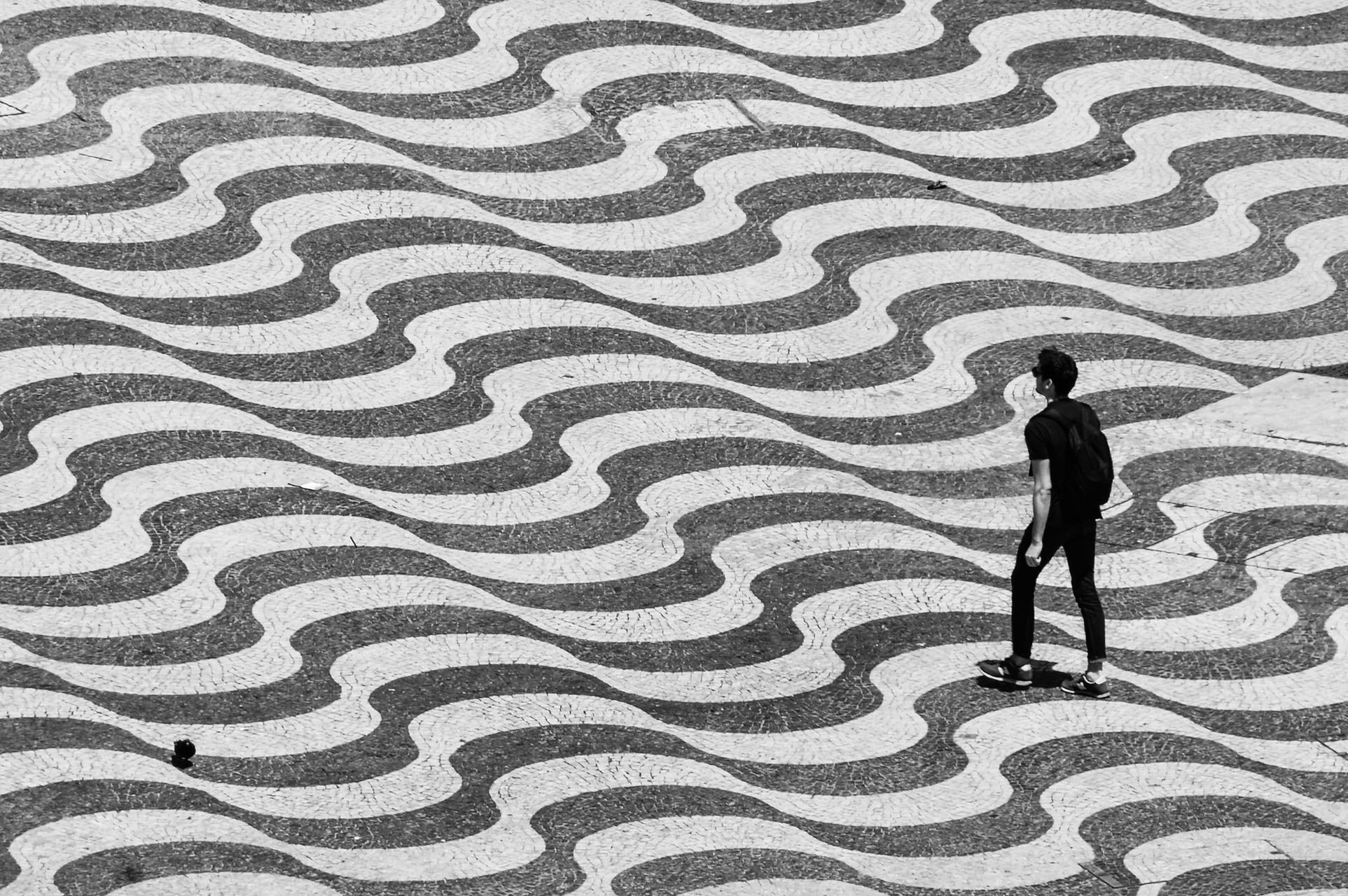
Drawing Attention: Negative space, the empty areas of the frame, isn't wasted space. It can actually draw attention to your subject by creating a sense of isolation or emphasizing specific elements.
Creating Balance: Negative space helps balance out the composition, especially when dealing with busy scenes with a lot of detail.
Evoking Emotion: The amount of negative space can influence the mood of your shot. Large areas of empty space can create a sense of loneliness, isolation, or vastness. Conversely, minimal negative space can feel crowded or claustrophobic.
When to Use Them:
Headroom:
Portrait Shots: Always ensure sufficient headroom for portraits, especially close-up shots, to avoid a "cut-off" feeling.
Candid Shots: Even when capturing candid moments, leave some breathing room above the person's head. You can always adjust slightly in editing if needed.
Negative Space:
Subject Isolation: Use negative space to isolate your subject from the background, drawing the viewer's eye directly to them.
Leading Lines: Negative space can work with leading lines to guide the viewer's eye toward your subject or point of interest.
Minimalist Compositions: For a clean and modern aesthetic, consider using more negative space in your shots.
Creating Depth: Strategic use of negative space in the foreground can enhance the sense of depth in your scene.
Depth of Field
Mastering Depth of Field allows you to control what viewers focus on and tell a visual story within a single frame. Control the amount of your scene that's in focus. A shallow depth of field throws the background out of focus, highlighting your subject. A deep depth of field keeps everything sharp, useful for establishing shots.
Importance of Depth of Field Matters:
Selective Focus: DOF lets you be the director of attention. By blurring the background or foreground, you can isolate your subject, making them the star of the show. This not only creates a more cinematic feel but also guides the viewer's eye exactly where you want it to go.
Storytelling: A single shot can be a narrative powerhouse with DOF. A shallow DOF, with a soft blur behind a sharp subject, can create intimacy or romance. On the other hand, a deep DOF, where everything is in focus, can establish a vast landscape or introduce multiple characters with equal importance.
Evoking Emotions: The amount of blur itself can be a language. A shallow DOF with a dreamy background blur creates a sense of isolation or a touch of mystery. However, a scene with a wider aperture and a harsher blur can evoke urgency or tension.
How to use DOF:
There are three main factors that influence depth of field:
Aperture: This is the key player. A wider aperture (indicated by a lower f-number) creates a shallow DOF, blurring the background beautifully. Conversely, a narrower aperture (higher f-number) brings most of the scene into focus, resulting in a deep DOF.
Focal Length: Telephoto lenses (longer focal lengths) tend to compress the background even at wider apertures, potentially giving you a shallower DOF effect. Wide-angle lenses (shorter focal lengths) generally offer a deeper DOF at most apertures.
Subject Distance: The distance between your camera and the subject also plays a role. The closer you focus, the shallower the DOF will be, even at narrower apertures. Stepping back from your subject usually increases the depth of field.
Choosing the Right DOF:
The ideal DOF depends entirely on the story you want to tell and the scene you're capturing. Here's a quick guide to get you started:
Shallow DOF: Ideal for portraits, close-ups, macro shots, isolating a subject from a busy background, or creating a specific artistic or dreamy effect.
Deep DOF: Perfect for landscapes, establishing shots, scenes with multiple important elements, or conveying a sense of vastness.
Size and Placement
The size and position of elements within the frame affect how viewers perceive them. A large object in the foreground signifies importance, while placing a character off-center can create a sense of mystery. Here’s why they’re important and when to use it:
Importance of Size and Placement:
Visual Hierarchy: The size and position of elements within the frame create a visual hierarchy. Larger objects naturally grab attention first, while smaller objects recede into the background. This allows you to tell the viewer what's most important in the scene.
Emotional Impact: Size and placement can evoke emotions. A large object looming over a character can create a sense of danger or oppression. Conversely, a small figure dwarfed by a vast landscape can evoke feelings of isolation or insignificance.
Leading Lines and Depth: The size and placement of objects can also work with leading lines and depth of field. Large foreground elements can draw the viewer's eye along a leading line towards a smaller subject in the background.
How to use Size and Placement:
Close-up of a character's face to emphasize their emotions.
A wide shot of a lone figure standing in a vast desert to convey isolation.
A large object in the foreground framing a smaller object of importance in the background.
Using negative space around a character to create a sense of mystery.
Foreground and Background: Utilize the foreground and background strategically. Placing a large object in the foreground can frame the scene and draw the viewer in. Smaller objects in the background can establish context or add depth.
Breaking the Rules
While these principles are good tools to consider when you plan your shot list and storyboard, don't be afraid to experiment. Sometimes intentionally breaking the rules can create a visually striking and impactful shot. Remember, these are just guidelines. The true power of composition lies in using your creativity and understanding these principles to create visually engaging and impactful shots that serve your story.
Master Video Composition at Slate Studio PVD
At Slate Studio PVD, Rhode Island's premier video production studio, we offer the perfect environment to bring your stories to life. Our state-of-the-art, acoustically-treated space is ideal for filming interviews, crafting narratives, and creating impactful promotional content. Slate Studio PVD is an experience you might’ve been missing out on as we offer private event rentals, meeting spaces, and workshops to fuel your creative process. Have a unique concept? We collaborate with you to turn your vision into a powerful reality. Success in video production hinges on exceptional composition. At Slate Studio PVD, we go beyond capturing your vision; we help you craft it into the blockbuster you dream of. Book a Call with The Slate Studio and start framing your success story today.


